(Unit 1 –
1.2)
J.PINK (Jonny Pink)
Jonny Pink is a Graphic Designer and a Creative Consultant. He specifically specialises in logo design, brochure design, business stationery and websites. These are the corporate branded materials which he is involved with and he has also worked on a range of projects over the past duration of fifteen years that have had benefits and an impact on particular businesses.
I have specifically chosen J. Pink as I can
effectively relate him to myself who is also an inspiration of guidance in
design.
I have come across many formal elements and
principles that are within Jonny’s work. These elements are an important part
of his role that makes his expertise a success. For example, not only one of
his designs itself, but how he presents his design effects the way we visualise
it.

 From a simple graphic format...
...to presenting the design on products
As you can see from the previous images, we can simply but effectively
visualise Jonny’s logo design on the product and the purpose of it itself. It
also creates a different effect on the audience from each individual technique.
The technique and presentation method always has an impact on the way we see,
feel and opinionate things.
The emphasis on image no.4 is simply obvious to the audience. We
can see that the circumference of the surrounding area of the image is focusing
on the jeans itself. This then immediately draws our attention to the detail of
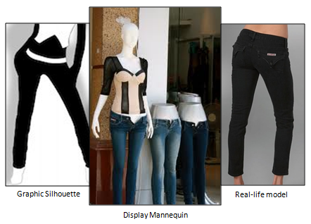
the product, the brand and the logo on the pockets. However, what they present
the product on also matters. Which method would you think that works best?
- The jeans placed on a graphic silhouette?
- On a textile mannequin?
- On a real-life model?
I personally think that the real-life model method would be the best
technique. This is because it represents what the design on the product would
look like professionally worn by real people. It also creates inspiration on
what the audience may choose to wear e.g. a particular style/design etc. However,
not only that, it also focuses the audiences’ attention on the design which
helps to sell the product.
| <><> |
Brochure Design
The use of colour in
brochure design no.3 really stands out with character as I think it has a
continuous, subtle theme throughout. I like the use of the blue border at the
top of the page, along with the important parts of the information and
subtitles being highlighted in the same colour. This ensures that the rhythm
and balance of colour is soft and in proportion with one another. The important
text highlighted in blue is emphasised to audience to make them jump to this
piece of text first. The exterior should draw attention first, following on
with the interior.
The light blue
colour has been specifically chosen for the brochures purpose and target
audience. The brochures audience is aimed at people who are nervous to have eye
surgery. The colour meaning of blue is calm and relaxation, which is a perfect
colour match in relation to calming nervous people down which the brochure is
trying to achieve.
The use of colour
also gives the design a fresh, clean and professional appearance to it. The
alignment of the text is left to the page which keeps the block of information
in balance with each other. However, if the text was aligned in the centre half
way through, this would become out of balance and would be a bad design which
could also cause confusion to the reader.
Brochure design no.2 is a simple, formal but yet an effective design.
The logo has been designed very cleverly which needs our perspective to see it
(the letter E and L combined). I like how colour placement has been used. For
example on a white background, the colour of the logo has been made blue,
enabling us to see the E from the background colour. As for the blue background and white logo
brochure, I like how placement and size has been used to make it a little more
interesting. It has been scaled up and placed onto the edge of the page making
us see the design of the logo at a different angle and perspective. The balance
of colour and placement in this brochure has a large impact on the design.
| <><> |
| <><> |
After looking at the elements and
principles in other designers work, it has inspired me in so many ways to
relate the techniques and methods into
my own design work. There are
many different designers and expertise out there which we sometimes may not realise
that principles and elements of design are used. The majority of everywhere
uses design and the formal elements that are within it. In addition to the
elements and principles, they are the most important technique to make a design
work and meet its purpose or a particular audience.
The summary of my thoughts and
opinions on other designers work has helped and developed my creative thinking
in design. When I design I think more broadly and out of the box, whereas
before I thought of one idea and stuck with it.
I also design with thought, reason and purpose, creating a design that has a story or meaning to it, which means a lot more value to the client.
I also design with thought, reason and purpose, creating a design that has a story or meaning to it, which means a lot more value to the client.
I have come up with a simple process
which makes a successful design and product. A successful design to meet the
client’s needs in order to sell their product well and efficiently.


No comments:
Post a Comment