Monday 3 December 2012

Unit 7 - Personal Statement


Unit 7 – Working in a team ;Learning Outcome 2 – Assessment Criteria 2.1
Personal Statement reflecting on my performance and behaviour as part of a team & assess what influence this has on others.

When starting here at T2, I had an initial induction listening and watching the team, to see their typical day in the life of working in the design industry. I also got involved in various tasks given to me by the manager which was for example, an admin related task, updating all of their training course documents. When my induction was complete I had a meeting with the manager and director, discussing how well I had done and how my day had been. An example of feedback which was given back to me was that I ‘worked well, got everything completed quickly and that I listened and understood the tasks given’ to me. Although expectedly nervous, but at the same time feeling comfortable and confident in T2’s atmosphere, I think that I had a positive approach to my behaviour and performance within the work place.
As I progressed to work with T2 I began with a weekly planner, stating actions for me to carry out each week. This helped me to stay organised and focused throughout each day. Every Monday and Friday I went onto T2’s e-learning training portal to access online learning about the relevant software which I would be using day in and day out within the work place of T2. When watching the learning tutorials, I noted down each category and key information for specific software, which I could refer back to, to revise and put into practice. This helped me to gain the knowledge and skills required to use the appropriate software.
Throughout the 8 month duration of me working with T2 so far, my performance and behaviour has increasingly grown and developed. I now have more responsibility in projects which reflects on the increased percentage of me being involved a lot more and working as part of a team. I communicate more with the team members now than what I did when I first started as I have more responsibility, share ideas and give constructive support and feedback. 
My confidence has grown and is still growing, I communicate confidently with the team using verbal and non-verbal techniques such as email. I understand the value of everyone elses ideas and support in projects which has also learnt me to communicate with each and correct team member in order to complete a project.
My share of the project e.g. creating the 2d side of the artwork, If require a specific element to complete the artwork, I then have to communicate with the team member that has the full responsibility of that element.
For example when working with Keepmoat Homes and I require a 3d image and house dimensions, because I put the artwork together graphically and I don’t have responsibility over creating 3d models or measurements because this isn’t my job role, I have to work as part of a team to get those elements to complete the end result. Each team member has their own responsibility in a project; we all work as a team to place each other’s work and responsibilities together to get the final result and project finished successfully and on time.

 My performance is developing quickly, learning new skills and more about each project I work on. T2’s main client ‘Keepmoat Homes’ is who I do the 2d artwork for, which my skills in this brand has developed greatly as well as my responsibility in the making process. From being a part of making the artwork once a week, my responsibility has grown to create more of the artwork and also the work load has increased from 1 to 5-7 Keepmoat projects per week.
I also self-manage myself when it comes to organization and what I work on next. I use my diary planner to keep note of what I have done and what needs completing. For example, when it comes to the weekend, the following Monday morning I will know what tasks to carry out as I would have planned my actions from the previous Friday.


My positive attitude and approach to working as part of a team influences other members as I am working on projects to help relieve the pressure of multiple projects that are all live at once and by giving them constructive feedback and changes to keep their work at their best standard. For example when I notice that something is wrong, I tell the team member who is responsible so that they can correct it or take my feedback on board.
I am very adaptable when working on projects, as I understand that changes do happen within the work of this industry. I always achieve the end result to suit. The reflection on my performance and behaviour is at high standard as I enjoy working with T2 in this industry sector and I think the skills and experience that I have gained will give me a great knowledge long-term for my chosen career path in Graphic Design.

Unit 11 - 1.1, 1.2, 2.1, 2.2, 3.1 - How the design industry works


      - Describe the concept of a 'design industry'
      - Explain what the design industry does and how it relates to other industries
      - Outline the entry opportunities for employment in the design industry
      - Outline key design areas and how they interrelate

-    - Describe briefly how the following factors may have an impact on the design industry;
                     - Globalisation
                    - New Technology
                    - Convergence
                     - Working across areas in design companies


The design industry evolves around a large range of designers throughout the country working in consultancies, in-house companies and as freelancers. The design industry is largely known and rated in London.

A lot of designers in the industry gain some experience working in a consultancy before becoming a freelancer or in partnership with other colleagues. The design industry covers around 2,200 design companies which includes in-house design teams, freelancers and consultancies. In the industry these work across communications, interior and exhibitions, digital and multimedia, fashion and design disciplines, product and industrial. There are many designers which is a competitive and challenging industry but also has a large impact on our lives. Everything around us is a design or someone's' individual thoughts made visual.

The design industry does many things which benefits many other industries. For example, other industries need concepts, designs and marketing materials to make their businesses successful. The design industry would relate to retail as they need fashion designers for their clothing etc, marketing designers to market their selves and their products, interior designers for decoration, layout etc for their shops, digital and multimedia designers for their website or television advertisements, and also maybe a photographer/ photo manipulation artist for their product photography.

In terms of homes and living, we wouldn't have houses if it wasn't for the architectural side. Architects need designers to design the homes and also to maybe market their homes to sell them. For example on a client that I currently work with; Keepmoat Homes, a housing development company, need architects to and designers to create their styled homes and then Keepmoat pass on the architectural information to us for us to design the marketing material such as brochures and sales leaflets to enhance to the chances of selling them to home buyers and families.

The Hair and beauty industry also need the design industry to become successful as they need product designers for their equipment, fashion designers for their uniforms, digital and multimedia designers for their logo and marketing materials etc and interior designers for the decoration of their salons.

It's not just different industries that rely on each other but also different sectors in the same industry also rely upon each other. For example digital and multimedia designers need product designers for their computer technology to become successful.  Fashion and interior designers may need digital and multimedia designers to market their selves and their work to grow and be a successful business. Exhibitions rely on interior designers to make show rooms attractive and appropriate, they also may need digital designers to create their marketing banners and signs etc.

The design industry is very large around the south east of England. It involves many designers which keeps increasing in various areas. To become involved and apart of the design industry there are specific entry requirements which you must have for employment in this industry.


Graphic Designer entry requirements

 The skills and personal qualities are essential which they must evidence on entry for employment in the design industry. They also must have a strong portfolio either paper based or digital/web. Work experience and qualifications such as a degree or diploma is also helpful towards employment. Some of the skills and personal qualities required are;

·        Creative Flair
·        Originality
·        Strong visual sense
·        Strong computer skills
·        Confidence to present and explain ideas to clients and colleagues
·        The ability to grasp client need and consider practical solutions
·        The ability to pay attention to detail
·        The ability to balance work on several projects at a time
·        Good team work skills
·        Flexibility
·        An awareness of the competitive business environment
·        A matter of fact when ideas or designs are rejected

These are the specific entry requirements that an individual must have to become a graphic designer in the design industry. However interests are also required such as; Graphics, typography and new developments in design software.
Fashion Designer entry requirements

The skills and personal qualities are essential which they must evidence on entry for employment in the design industry. They also must have a strong portfolio either paper based or digital/web. Work experience and qualifications such as a degree or diploma is also helpful towards employment. Work experience in a design studio or fashion retail will also be helpful on entry. Some of the skills and personal qualities required are;

·        Creativity, innovation and flair
·        An eye for colour and feel for fabrics / materials
·        Design and visualising skills, either by hand or computer aided design. CAD
·        The ability to generate ideas and concepts
·        Garment technology skills / knowledge
·        Technical skills including pattern cutting
·        A positive approach, attitude and enthusiasm
·        Commercial awareness and business orientation
·        Interpersonal, communication and networking skills
·        Self promotion and confidence
·        Negotiation, team working and influencing skills
·        Organisational and time management skills


Industrial / Product Designer entry requirements

The skills and personal qualities are essential which they must evidence on entry for employment in the design industry. They also must have a strong portfolio either paper based or digital/web. Work experience and qualifications such as a degree or HND in spatial design, 3d design, product design or industrial design is also helpful towards employment. Some of the skills and personal qualities required are;

·        Visual, commercial and spatial awareness
·        Computer literacy, 3d conceptual ability and CAD
·        High degree of technical knowledge balanced with creative ability and a hands on approach
·        Knowledge of industrial processes, techniques and standards
·        Communication and customer facing skills
·        The ability to cope with the pressure of project deadlines
·        A willingness to build and maintain positive working relationships and to share information with others
·        Determination to achieve an end result, an optimism and enthusiasm when things don't go according to plan
Furniture Designer entry requirements

The skills and personal qualities are essential which they must evidence on entry for employment in the design industry. They also must have a strong portfolio either paper based or digital/web. Work experience and qualifications such as a degree, BTEC or HND in furniture design, furniture studies, product design, furniture design and making, Art and design, 3d and spatial design, ceramics and glass, or furniture technology is also helpful towards employment. Some of the skills and personal qualities required are;

·        Creative and practical ability
·        Drawing skills and strong visual awareness
·        Manual dexterity and good hand-eye co-ordination
·        Knowledge of industrial processes and techniques, safety issues and specialist fields or materials
·        An understanding of computer aided design (CAD)
·        Communication skills
·        Commercial focus
·        Flexibility and adaptability
·        Self motivation, self discipline and persistence
·        the ability to work to deadlines
·        Team working ability as furniture designers may be required to work closely with other professionals such as architects and interior designers
·        Business and marketing skills if ever wanted to go self employed
·        A desire to keep up to date with market trends and new ideas


Another entry that is available into the design industry is to start out as an apprentice, intern, assistant, work experience or voluntary work. Apprenticeships are work based learning schemes which are available at all levels to suit knowledge. An apprenticeship is government based scheme which pays £2.60 per hour to an apprentice. This helps to cover the learners equipment and travel costs etc to attend work and college. The apprentice has day releases to attend college within the week.
Apprentices responsibilities may begin very little, however throughout the apprenticeship, the learner will progress onto further responsibility as their knowledge within the workplace will expand. For example, an apprentice may start off by doing simple tasks such as tea making and general office duties, then developing onto more responsibilities such as client liaison and more control over project involvement.

Apprenticeships are a great way of entering the design industry. This is because you can achieve qualifications as well as gaining the skills, knowledge and experience of working in the industry. The managing director may also give you the opportunity to apply for a full time job in the work place.

As far as work experience and voluntary work is concerned, it is a great way to gain experience in the design industry and will look good on your curriculum vitae, however this is unpaid work and doesn't support a definite opportunity to work in the industry full time unless the managing director would like to employ you.


After looking at the entry requirements for various job roles, I have noticed that they all have very similar requirements with slight comparisons and differences. All are essential and must be evidenced effectively on entry for employment in the design industry.

3.1 -


Globalisation has a big impact on the design industry, both positive and negative affects on organisations within it. Design businesses can now do much more with the use of the latest technology. Not only can they use up to date design software packages and new technology to produce the best quality work, but they can also communicate with people all over the world. This is where convergence has an impact, as businesses can connect to these people using social networking such as Twitter, Facebook, Linked-in and Skype etc. This allows design teams to have conference calls for example, from country to country. This results in a globalisation affect of gaining a wider field of clients which will make companies much bigger with more projects and clients around the world which will result in a better finance income and popularity rate. This has a positive impact on the design industry as this makes them more successful.

Design teams can also use emails to contact clients all over the UK and in different countries. Airmail is no longer used as much as it was in the past, as now we can send clients big files as PDF files which makes them much smaller or we can use a software called FTP which is a web based zip file that clients can download.   In terms of convergence, designers can design for new platforms easily such as websites, phones, iPads and applications etc.

Globalisation can also have a negative impact on the design industry as competitors in other countries can offer lower prices as their pay rates are different to the UK, which makes it cheaper for clients in the UK to use other businesses in different countries because they are getting their required service at a cheaper rate. This can have a negative effect on the amount of clients we get in the UK because their using foreign businesses. The lower they charge in cost, the more clients they get than companies in the UK. However positively, the design industry can use services abroad because then it is cheaper for their expenses.  

The new technology can also have a negative impact on the design industry as they need to keep up to date and buy the latest design software packages to keep up to level with quality of work. However the effect is that all companies may not be able to afford the latest technology and software which makes them a lower level than companies with the latest software and technology. This results in the loss of clients, projects and money income. People that don't necessarily specialise in the design industry but still have the new technology and software, allows them to do work and designs their self, with the ability to watch training tutorials online. This results in clients not needing the design industry for their requirements as they are able to do it their selves.

Working across areas in design companies can have an impact on the design industry as these areas need to be understood for different aspects of a design to be more successful and achievable. This is because designers need to understand the different design areas to have the ability to work with and have the knowledge of others and know how the processes are done. 

Working across disciplines in the design industry can have an impact on the way you work. The general disciplinary is to attend work every day as contracted, turning up on time, wearing the required clothing, knowing the requirements of your job role, continuing to do the job without slacking and sticking to the basic disciplinary working rules. This has a positive impact on the way you work as you will enjoy it and will be organised with good time management as well as being professional with the appropriate positive attitude towards work.
However, if you do not work across disciplines in the design industry then your job role could affect yourself and the design team negatively.


Unit 15 - 3.1, 3.2 - Provide written information in relation to design work


       - Why should written information only be passed to those people who are authorised to receive it?
-      - How would you maintain confidentiality with a piece of written work?                   


Written information may only be passed onto those individuals who are authorised to receive it as this could be private and confidential with personal information. Confidential information should not be shared with any other individual that are not authorised to view what is written. This could be confidential information in a workplace which can be defined as keeping the employee and client information private.

Employees have the responsibility of keeping all the information in the workplace private and treating it with care and caution. When an employee has been authorised by the client to see their confidential information, they should refrain from sharing the details with colleagues at work as this is personal. This keeps a professional atmosphere and attitude within a workplace.

Only specific staff can have access to internal data such as employee health data, salary structures, application forms, references and personal information such as home address etc. If this reaches an unauthorised viewer by an employee, this may result in dismissal.

To maintain confidentiality in the work place all personal data and confidential written files should be kept and safely stored to avoid unauthorised access, misuse or loss. Another way to maintain confidentiality is to keep the data stored electronically, using firewalls, encryption and password protection. Having kept data stored traditionally and electronically this will ensure a maintained protected way of maintaining confidential information.

All employees within a workplace must also abide by the protection act and also when employing new staff, it is a good idea to ensure that they are trained and have the knowledge of maintenance on confidential information. This should also be held in meetings to refresh knowledge and confirmed authorisation.


Tuesday 11 September 2012

Unit 14 - Explore the use of colour in a creative environment

1.1 - Give examples of colour theory;


Colour theory involves the use of definitions, concepts and design applications. Colour theory is used broadly in design to evoke feelings and relationships between human nature and graphical elements. Examples of colour theory lie in 3 categories, which are logical but also useful. These categories are; the colour wheel, colour harmony and the context of how colours are used.


First of all, I think that the exploration of the colour wheel is seemingly interesting. The colour wheel is a circle with interior pigments based on primary colours, red, yellow and blue. In relation to my research, from 1776 to present, colour wheels have evolved greatly in its format, from traditional (using paint and pigments) to a computer graphic format which we can produce today using smart software e.g. Adobe Illustrator. 


                                 Three color wheels - Harris, Today, Goethe


Colour wheels begin with a 3-part sectioned circle to a 12-part circle. As the sections increase, the wheel presents a logical and useful sequence of pure hues and shades.

3-part colour wheel represents; Primary Colours:


  • RedYellow and Blue

3 pigment colours that can not be mixed or formed by any combination of other colours. All colours are made from these 3 hues.


A 6-part colour wheel represents; Secondary Colours: 

  • Green, Orange and Purple

These colours are formed by mixing the primary colours together e.g. 
Red + Yellow = Orange
Blue + Yellow = Green
Blue + Red = Purple

A 12-part colour wheel represents; Tertiary Colours:

  • Red - Orange,  Yellow - Orange,  Red - Purple,  Blue - Purple,  Blue - Green, Yellow - Green
These colours are formed by mixing a primary colour and a secondary colour together. This is why the colours are two-word names, including the primary colour and secondary colour name which results in a tertiary name.

                                   
                                      3-Part                             6-Part                             12-Part


Primary Secondary Tertiary Colors


Colour Harmony;

Another category in the colour theory stated earlier was colour harmony. Colour harmony can be defined as an arrangement of parts that is pleasing to the eye in visual experiences. It is the art and science of colours that work well together and look good, producing a colour scheme that looks attractive. 
If a visual experience is not harmonious, a human brain will not engage the information and will reject the arrangement of what the brain cannot organise or understand. An inharmonious visual experience will appear chaotic, boring and so overdone that the viewer cannot stand to look at it because it appears too harsh to the eye and their visual experience. 

Colour harmony is a dynamic equilibrium which delivers visual interest and a sense of order and balance. Extreme unity leads to under-stimulation, whereas extreme complexity leads to over-stimulation. 


Colour Harmony Formulas;

Colour harmony is achieved by arranging particular colours as formulas. These are the few of the formulas which create different experiences:

  • Analogous
  • Complementary
  • Natural
  • Monochrome

Analogous formula;
Analogous colour scheme is an arrangement of any 3 colours which are side by side on a 12-part colour wheel, for example: Yellow - Green, Yellow, Yellow-Orange.
The middle colour is known to be the ruling colour of a colour scheme. E.g. The middle blue is the dominant ruling colour, whereas the other 2 shades of blue at either sides are used to enrich the colour scheme. 


Complementary Formula;

Complementary colours are the arrangement of any 2 colours which are directly opposite each other. For example: Red opposite with Green and Red-Purple opposite with Yellow-Green. If these colours were placed at the side of each other, this would intensify the formula. Varied colour shades in an image create maximum contrast and stability. This is mostly seen in images of nature at most times, e.g. plants and flowers; green leaves and stem with a bulb of red petals. 


Nature Formula;

These colours are an arrangement of colours from nature and natural resources. This colour formula creates a harmonious design e.g. the colours Red, Yellow and Green. 


An example of an Autumn colour scheme in a nature formula arrangement.


Monochromatic Formula;

Monochrome colour scheme is delivered from a single base colour which is then extended by using its shades and tints, modified by the addition of black and white. 
Monochromatic colours create a little contrast and can visually appear boring unless there is some diversity in the design. As a result, when there is a lack of colour contrast, it creates the energy in an image to appear more subtle and peaceful. However, monochrome colours can have a powerful approach when a piece of artwork has been entirely adjusted in it's saturation and tones. 


The context of how colours are used;

When and how a colour behaves when it is placed with another colour, we perceive the colour to appear differently. This is because the colours context can make our brain receive the colours differently through our wave lengths and RGB filters, the surrounding context colour has an effect on the chosen colour that we see. 

The illustration below for example, the two squares surrounded by different context colours are actually the same colour, brown. However the one on the left appears to be a lighter brown with soft edges this is because the 2 colours are complementary colours which when placed together they look intense, whereas the one on the right appears to be a darker brown with sharp edges, this is because they are analogous colours which are side by side on the colour wheel.  

albers_interactionofcolour.jpeg


On this illustration the two squares shown A and B are both the same colour. However our brain receives the colour of square A to be much darker because square B has been placed in a different shadow situation.

Grey_square_optical_illusion.png


The red square is our main focus on this illustration, they are all the same shade and are all the same size. However as to what colour context it is placed on top of, the red square behaves differently and appears differently to our perceptive eye. 
As you can see, the red square placed on a white context makes it appear dull looking, on an orange context  the red square looks lifeless, on a blue context it appears bright and harsh to look at and on a black context, the surroundings make the red square appear larger and defined.


On this illustration we are concentrating on the small violet rectangle in the middle. Again, these two rectangles are the exact same colour. However, due to its context, it appears to make the left one look darker and have a red haze on it. Whereas the rectangle on the right looks lighter and sharply defined. 


Colour placement and the use of colours that are chosen from the colour wheel to work together and look good is really important in design. A bad colour scheme is inharmonious and is chaotically unattractive. The exploration of colour theory is very logical but also useful and important in human nature and design. The previous categories which i have explored need to be considered where ever or when ever using colour. 


1.2 - Explain colour attributes and colour relationships


There are 3 attributes of colour;

  • Hue - is the particular wavelength of lights spectrum and is the name of a colour (red, blue, green, yellow) The colours of the spectrum are called hues.
  • Value - is the lightness and darkness of a colour
  • Intensity - is the bright or dull quality of a colour (saturation, chroma)

Hue;

First of all I am going to explore the first attribute, hue. Hue is the name of a colour, such as red, green, or even blue. This attribute is known as a pure colour without tint and shades which also indicates the colours' position on the colour wheel and whether it is a warm colour or a cool colour. The difference between the word hue and colour is that colour contains all 3 dimensions named in the list above (hue, value, intensity). However, the word hue only contains 1 dimension which is itself and is only a part of a colour.
Colour can be very subjective and specific, whereas primary, secondary and tertiary hues all appear to exist and be processed in the human brain and memory.


Value; 

Value refers to the lightness and darkness of a colour. Each spectrum colour has a value that is relative to other hues of the spectrum. Yellow is very light in value, where as violet is very dark in value. The other hues in between these two obvious values, range in various values but not as extreme as the two mentioned.


There can be a variety of values within any one hue such as:

  • Tints - Light values (hue plus white) Red becomes pink
  • Shades - Dark values (hue plus black) Red becomes maroon
  • Tones - Medium values (hue plus black and white, or grey)
Black and white pigments are important when changing colour values. Shades are simply produced by adding black to a colour, whereas tints are produced by adding white to a colour. 
Values are very important in designs and paintings. Colour seems to be deeply thought about but in my exploration, I have found out that value is the attribute which seems to be whispered and is forgotten to be considered and is less thought about.


Intensity;

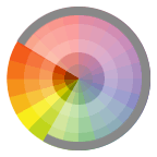
Intensity is the saturation of a colour which refers to the relative purity of a colour. Intensity is the bright or dull quality of a colour. It also indicates a colours degree, strength, purity and saturation which is determined by the quantity of the dominant hue. Chroma is how pure a hue is in relation to grey. 

To de-intesify a colour, you can simply add little bits of its complementary colour. 
Using 2 complementary colours to its full intensity, causes a state of visual distress which we can relate to ''clashing colours''.


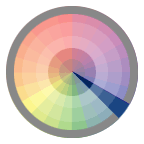
                       Intensity colour scale- [ Dull quality hues - Bright quality hues ]


Local Colour or Object Colour;

Local colour is the actual real-life colour of something, e.g. blue sky, green grass. However the play of light can change and differentiate these local colours. The apparent colour of an object of what we can see, is always dependent on the level of wavelengths of light being reflected from the object we are looking at.


Colour Relationship;


Colour relationship is really important when producing a colour scheme, harmony and a balance of colours. The relationship between colour needs to work well together and appear balanced and attractive to our visual experiences. This is formulas of colour relationships;

Monochromatic Relationship


Monochromatic Relationship are colours that are shade 
or tint variations of the same hue.


Double-Complementary Relationship


                                 Double-Complementary Relationship are 2 complementary colour sets. The distance between selected complementary pairs will effect the overall contrast of the final composition.


Complementary Relationship


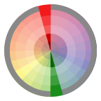
Complementary Relationship are colours across/adjacent from
each other on a colour wheel.


Split-Complementary Relationship

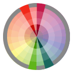
                                  Split-Complementary Relationship is one hue plus 2 others equally spaced from its complementary colour.


Triad Relationship


Triad Relationship are 3 hues equally positioned on a colour wheel, 
creating an equilateral triangle on the colour wheel.


Analogous Relationship

                                    Analogous Relationship are 3 colours side by side on a colour wheel. The middle hue is the dominant ruling colour and the ones either side are to enrich the colour scheme.


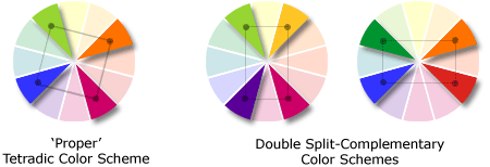
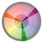
Tetrad Relationships are combinations made up of four hues equal distance from one another, forming a square or rectangle on the colour wheel.


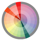
Diad Relationships are combinations of 2 colours located 2 steps apart on the colour wheel, skipping a colour in between.


This is an illustration which I created in Adobe Illustrator to show that wearing complementary colours also matters to the harmonious eye.
Wearing a bright blue outfit with bright orange accents with both colours at full intensity can be a problem and chaotic if both colours have equal parts. However on the left illustration, the area covered by the intense orange is much smaller than the blue which results in a harmonious balance, so the arrangement of the complementary colours work well together. 
On the right illustration, wearing equal areas of both orange and blue works well together as long as they both are not at full intensity. This arrangement in the illustration shows that the orange is only at full intensity, whereas the blue has been greyed down by mixing a small amount of its complementary colour; orange, so the combination works well as a harmonious colour scheme, a satisfying balance and unity of colours.

In the above illustrations as spoke about, in the colour wheel orange is a warm hue, whereas blue is a cool hue. Warm colours optically advance and expand, while cool colours recede and contract. The relationship with warm and cool colours evoke feelings and emotion.

Below i have created an illustration to show that complementary colours can contrast from each other well. For example, when creating a shape you can place a thin line or stroke around the edges with its complementary colour. This will make the interior colour emphasise itself from its surroundings.


Colour relationships are really important when designing or using colour. It creates different emotions and feelings towards that certain piece. The colour wheel can be a great tool to use to create a harmonious colour scheme that is attractive and works well together. 
The attributes of colour and how much you use of it also matters. You have to balance the hues that you use if you are using them at full intensity or one that has been greyed down. 
Colour clashing or the wrong use of attributes can really destroy your artwork. Each element, attribute, relationship and the whole theory of colour needs to considered.


1.3 - Describe how different cultures associate meaning with colour


Blue is the nature colour for sky and water, but is rarely found in fruit and vegetables. Blue is embraced as the colour of heaven and authority, denim jeans and corporate logos.Its referred to as cold, wet and slow in comparison to reds' warmth, fire and intensity. 

The generic meanings for shades of blue are;

Dark blue - Trust, Dignity, Authority, Intelligence

Bright blue - Cleanliness, strength, dependability, coolness. These meanings arise from the qualities of the ocean and inland waters. 

Light (sky) blue - Peace, serenity, ethereal, spiritual, infinity. These meanings are aspects from the sky.

Most blues convey a sense of trust, loyalty, cleanliness and understanding. 


Global and Unique Meanings of blue in different Cultures;

In America, blue is a symbol of depression. Some people refer to their selves as ''feeling blue''.

53% of the flags in the world contain blue and it is also the most common colour used in corporate identity.
In the area of clothing, a dark blue suit is professional business attire and also blue jeans are worn all over world. 

Greece; Greeks believe that blue wards off the evil eye.

German; "blau sein" to be blue, means to be drunk.

Russia; "ronybon" light blue means to be homosexual.

Korea; Dark blue associates the meaning of Mourning.

China; Shades of blue are described as shallow or deep instead of light or dark.

Belgium; Blue is for a baby girl whereas pink is for a baby boy. 

Italy and Spain; The Prince Charming is called The Blue Prince.


Pinks


Pink is the combination of pink and white, it is a hue that can be described as a tint. However, this colour has many influences on others around the world.

In almost every culture, blue is associated with boys and pink is associated with girls. However, blue is considered as a calm, passive and feminine colour, whereas red-pink is considered as an active and masculine colour.


In the English culture, the verb "to pink" means to prick or cut around the edges as with pinking shears. The jagged petals of the flower above looked as though they had been cut.

Ancient Egypt; A flamingo was the hieroglyph for the colour red.

Belgium; They dress boys in pink and girls in blue.

Colour "sayings" in different cultures and their meanings;

"Tickled Pink"; State of Joy.

"Pink Slip"; Fired from your job/occupation.

"In the pink";  In good fortune and health

"Pinko; Person who is extremely liberal, a socialist or communist


Reds


Red is a very common colour across countries. First of all I am going to explore its meanings and symbolisations. 

Red symbolises; Passion, Love, Seduction, Violence, Danger, Anger, Adventure, Fire, Blood, Energy, Primal life forces, magical and religious.

Red is a symoblised super-human heroism to the Greeks and it is the colour of Christian Crucifixion. Red used to be as rare as purple is today.

It is the most used colour on flags in the world, 77% of all flags include red as well as it being the international colour for "STOP". Its one of the top two favourite colours of all people and when we use intense red dyes, these dyes are made from crushed insects such as lac beetle and the cochineal.


Unique meanings of Red in different cultures and meanings in which they associate it with;

Asia; associate red with the meaning of 'Good Luck'

China; this is their most popular colour in their country

Japanese Children;  draw the sun as a big red circle.


East Asian stock markets; use red to denote a rise in stock prices

North Asian stock markets; use red to denote a drop in stock prices.

Russia; the word 'red' in this country means beautiful.

Red is a colour used for marriage in many countries. In India and Nepal, brides wear red saris whereas in Japan, they wear a red kimono which symbolises happiness and good luck.


Red captures attention and focuses behind the retina of the eye which forces the lenses to pull forward. Therefore we receive that red areas are moving forward.
In health terms, it is claimed that the colour red raises your blood pressure and quickens your heartbeat.

There are two types of red; tomato red which is yellow based, and berry red which is blue based.


Purples


Purple is a very rare colour in terms of nature reference and it is a colour that people either love or hate. Only 2 flags in the world contain purple. It has many meanings in which it symbolises, some of them are; nobility, luxury, magic, mystery, spirituality, creativity, dignity and royalty. 

However, the different shades of this colour also has different associations with meaning. For example, light purples are known to be referred as a light hearted colour, floral and romantic. Whereas dark purple shades are more referred to as an intellectual and dignified colour. 


Global and Unique meanings of purple in different cultures;

Mediterranean culture; purple was reserved for emporerors and popes. 

Japanese; christened the colour to be "imperial purple"

UK, Italy, Thailand and Brazil; purple is the colour meaning of mourning or death.


Unique meanings of purple in different cultures;

America; the "purple heart" is an american award for bravery.

Western cultures;  purple is a symbolic colour for the gay community.

Italy;  most performing artists wouldn't go on stage if they had to wear purple.

Roman Emperors Julius and Augustus both obey that only the emperor could wear purple. When Nero became emperor, it came around that if anyone and the wearing of purple or even the sale of purple would happen, they would be punished by death.

The colour purple is also a very popular colour for children's television cartoon characters such as barney and tinky winky from the teletubbies.


Purple is used for children's cartoon characters as it is referred to be a happy and creative colour.

It is the hardest colour for the eye to discriminate. However, purple helps to balance the mind and transform obsessions and fears.


Yellows


Yellow is the most luminous colour which captures our attention more than any other colour in the spectrum.
In terms of nature, yellow is a comfortable and natural colour of the sun, sunflowers, daffodils, egg yolks, sweetcorn, lemons, bananas, canaries and bees. 

Yellow is the colour of many various things in our contemporary hand made world. For example, from graphically made cartoon characters such as sponge bob, to useful objects such as post it notes and signs that alert us to danger or diversions.

It is the colour of happiness which is why 'happy faces' are made in the colour yellow. It also symbolises optimism of enlightenment, creativity, sunshine and spring.


Global and Unique meanings of yellow in different cultures;

In almost every culture in the world, yellow represents sunshine, happiness and warmth.

Hinduism and Ancient Egypt; associate the colour with the deity which is a supernatural being that they believe they can communicate with.

Japan; associates this colour with courage.

China; refer adult movies to be yellow movies.

Russia;  their expression for an insane asylum is used to be a "yellow house"


Mexico; bright "marigold yellow" is associated with death, as those condemned to die during inquisition wore yellow as a sign of treason.

Jews was labelled with a yellow patch in the middle ages.

European Jews  were forced to wear yellow or yellow "stars of David" during the Nazi era of prosecution.

Yellow is the colour of traffic lights and signs indicating caution all over the world.


Oranges


Orange is the only colour in the spectrum whose name was actually taken from its object - fruit. 
It is vibrant, hot, healthy, fruity and engaging. It is a polarising colour which symbolises energy, vitality, cheer, excitement, adventure, warmth and good health. However, pure oranges can be more brass and abrasive which may suggest a lack of serious intellectual values and bad taste. 

People usually either hate or love this colour. There are many variations of this colour which are related to natural foods. For example;


Terracotta or Cayenne - dark orange


Persimmon - red orange


Pumpkin - pure orange


Mango - yellow orange


Salmon - pink orange


Melon - light orange


Darker oranges offer a sense of comfort, some are earthy and some are spicy. 
Lighter oranges are soothing and healthy.


Global and Unique meanings of orange in different cultures;

Orange evokes the taste of healthy fruits, bursting with juice. It's associated with vitamin C and good health. Children all over the world are drawn to this colour which is also symbolic to the autumn season. 
It is also used for the colour of life rafts, hazard cones and high-visibility vests.

Royal Family; orange is the name and emblematic colour of their family

United States;  use the colour orange for prison uniforms

Hinduism; associate orange saffron as a sacred and auspicious colour

France; use orange for their middle traffic light

United Kingdom; the colour stands for the Northern Irish protestants and has very strong religious and political significance.


Greens


Green is a very natural and common colour. It can be found on many objects as well as grass, leaves etc. For example; Pea soup, vegetables, plants, carpets, emeralds, bathroom walls, cars, furniture and clothing.
Green also signify's growth, rebirth and fertility.

Some European countries have outlines certain traffic light colours so that it is clear which is green and which is red, by the colour that has a rectangle round it. 
Some states in the U.S have placed diagonal lines through the green traffic lights as an aid for the colour blind.


Green exit signs are important in the international community as they do not disguise their selves in the event of a fire because of their colour. This is because if a red exit sign was used, it would blend in with the fire's colour which wouldn't enable our eyes to capture the sign at it's full intensity. This is why green exit signs are used as it is complementary to red, making the green distinguish itself from red.


Global and Unique meanings of green in different cultures and their associations;

Green is universally associated with nature in which symbolises ecology and the environment. Traffic lights are also green for 'go' all over the world.
Green cars are not seen on race tracks as they are considered to be unlucky.
China; green symbolises infidelity, a green hat symbolises that a man's wife is cheating on them.
Israel;  associate green with bad news.
Japan; the words for blue and green "ao" are the same
Spain;  racist jokes are associated with green
Australia; this colour is bad luck in their culture, especially for circus and travel show men
Western cultures; green is associated as lucky, (green shamrock)


English language associations "sayings";
"Be green with envy"; means 'envious'
"Green behind the ears"; means 'immature'
"Green around the gills";  means 'nauseated' 


1.4 - Give examples of how designers use colour to distinguish their work


First of all I am going to explore the use of colours when designing and what these colours can evoke in our contemporary world. In the effective use of hues we can make an object or any kind of material meet it's purpose to send out a message to the correct audience.

Designing with blue ;

When using this colour, it has to be used carefully but effectively. If excessively used, this may wind up a design cliché if used alone as a colour. Combining this hues with another colour creates a more creative and harmonious effect.

Blue has low luminance and our visual resolution of fine detail is poor for this hue. This is why we have to be careful when using blue on a background colour. For example, when using blue text on a black background, it is hard to distinguish the two from each other in harmonious terms as it appears chaotic and harsh to the eye.

For best contrast and distinguishing purposes, it is best to use blue text on a white background, or white text on a blue background. This makes the focal point sharp, full of detail, subtle and prominent.           

Designing with Red ;

When designing with red it best to use it when you wish to capture a viewers attention immediately to a subject. However you have to be very careful as it can be very empowering and harsh.

Red focuses behind the retina of the eye which forces the lens to pull forward. Therefore we then perceive that red areas are moving forward.

This can be a very unpleasant colour and can evoke us to feel angry or in danger. However, it is claimed that red raises blood pressure and quickens your heartbeat.
In work-related environments, it is also researched that it causes people to make more mistakes and feel intimidated.

For example, fire engines and fire extinguishes have been designed red to insinuate danger and attention. However in my opinion, I think that fire extinguishes should have not been designed in the colour red, because if in the event of a fire this would be camouflaged by the colour of the fire itself.


Designing with Yellow ;

When designing with this colour it is best to experiment with the different shades that are available. There are strong mustard yellows and deep yellows, but there are no dark yellows.

Yellow is the most luminous colour in the spectrum which has a highlight reflectance value and therefore it acts as a secondary light source. Excessive use of bright yellow can irritate the eyes as the human eye processes yellow first. This is the reason why caution signs and emergency rescue vehicles are designed with yellow. Our peripheral vision is 2.5 times higher for yellow than red.


After looking into the basics of designing with primary colours, I am now going to look into designers work and how they use colour methods to distinguish their work.


Saul Bass

Saul Bass is well known as the most versatile and innovative graphic designer. Saul distinguishes his work by the use of block, solid colours. Not only that, he also uses colour in a way that we can identify by cluttered imagery and geometric designs using angular shapes and primary colour schemes.

I have noticed that the designer mainly creates his artwork in the colour orange. The colour orange stimulates creativity and offers a thoughtful control which promotes personal power. It also gives the ability to adjust to changes which can be helpful in the design industry as unexpected changes happen. This colour could help Saul himself stimulate his creative thinking and give him the positive attitude and confidence when designing his art work.


This is one of his pieces of artwork which I have specifically picked out due to his use of colour and how he uses it. Again, he has used the colour orange which he has used effectively with the technique of the face and the gun being visually clear due to the colour placement method.

The colour orange also relates to his imagery, power and mental quickness. Yet again for what his work is distinguished by, his use of block solid colours. The main colours black, white and the accent colour of orange, makes the image of the emphasised gun illustration stand out first with the face faded into the shape of the gun second.

Saul's work is distinguishable by the use of colour and I think the result is very simple but yet effective.


Peter Saville

Peter Saville is a well known art director and graphic designer. He simply distinguishes his work by the use of colour, yellow. He mainly uses black and yellow which creates a high intense contrast that emphasises and captures attention quickly. His designs are simple placements of shapes and letters which creates an effective and pleasant result.

Yellow has many effects on his artwork as well as what emotions it evokes on his audience and also how it makes Peter feel himself. Yellow is full of creative and intellectual energy. It evokes people to feel happy and optimistic. It stimulates motivation and productivity. This colour could help Peter in his design processes as it helps you to feel expressive, creative and free.


 This is one of his pieces of artwork which i specifically picked out for the reason of the work being distinguishable in colour. However, I also like the effect of the design. As you can see he has created a graphic of a man holding his ears to protect them. He has duplicated the graphic and has moved it repeatedly out of place slightly. This results in the effect of sound vibration which relates to the purpose of the message. Peter's distinguishable colour yellow and black also relates to caution and hazards.

The colour placement and effectiveness of the graphic creates
intense emphasis and stands out greatly.
              His work is very identifiable and is a simple effective use of colour.


2.1 / 2.2 / 2.3 -  Test different colours and colour combinations / Use own ideas to challenge or confirm a colour theory / Show how colour can be used to communicate a particular idea or concept.


When using colour in design, we have to test different combinations to see what works well together and what doesn't.
I am going to test this by using a piece of artwork that we produce for Keepmoat Homes.


This is the original piece of artwork. The colour combination works really well for this design as I have explored that the colours red-violet and yellow-green are complementary colours on the colour wheel. This makes the design harmonious and subtle. The colours are also in relation to the nature and colour of the site plan -grass. I have also used house type colour keys to communicate with the viewer to show which house type is which on the site plan.
I am going to experiment with different combination colours to see how they can effect the design.


 As you can see, I tested a colour combination to show what doesn't work in a design. I used mainly the primary colours which I set at their full intensity. This is really harsh and unpleasant to the eye. The colours are not harmonious and do not complement with each other. There is no colour balance and as for the text, the blue against the red is really extreme. This makes the text really hard to read and makes the text appear as though it has a haze around it. However in comparison to the text on the original design, its visually easy to read and has sharp detailed edges. The reason for this is because it is a dark colour against a light colour, whereas on the testing colours, blue and red are both dark colours, which doesn't distinguish the two from each other making it difficult for our eyes to eliminate.

This colour scheme does not work as it is inharmonious and unpleasant to the human eye. We cannot distinguish the colours from each other without it appearing too harsh as it is too much of an intense colour scheme.


This is a test for the colour combination of yellow-orange and blue-violet. These are complementary colours on the colour wheel. I made the colour at the top at a high intensity whereas the strip at the side is a lower intensity. This colour scheme could work, however I prefer the original design as it relates to the colour of nature which is based around homes and plantation. I made the text white against the orange so that it is visually contrasts and is easy to see and read.


The different values of each colour can make the scheme harmonious and pleasant. However, after testing with different colour combinations, my thoughts on the tests would be that the yellow-green and red-violet works best. The reason my thoughts are this is because they are complementary colours on the wheel, they are harmonious and pleasant to the eye, and also they work well together and relate specifically correct to the purpose of the artwork being evolved around nature. 


When creating any document the use of colour to communicate it makes it much more effective and will draw attention much more than the one with no colour. Highlighting specific words that are important in colour, will draw the communication to that specific section. An example below is a quotation document that I created showing one using colour to communicate my concept and one without.


2.4 - Explain potential limitations of colour theory in design work

When designing with colour it is essential to think about the colour theory. However, there are potential limitations which you also need to think about. These can effect us using certain colours in a design as there are limitations in connotations and colour blindness.

For example, this map here showing the amount of  high income (green) and low income (red) in countries.


This is a green-red colour scheme which someone with normal vision would be able to see. This is where one of the colour limitations comes into place with someone that's colour blind and can't distinguish the two colours from each other or visualises them as different hues.


 This is how someone with green colour blindness would be able to see the design.


This is how someone suffering with red colour blindness would see the design.


Another limitation of colour theory in design work is how it associates with other cultures. The map currently represents red as negative and poor, whereas green represents positive. However, the limitation of culture associations is that most Eastern cultures such as china and Israel, represent green with negativity, unlucky and bad news. Whereas red is represented as happiness, positive and love.
Therefore the design would not work because the colour meanings are limited to which culture represents them with. Also the limitation of colour blindness would not be able to see the meanings and effect because they would see the colours differently.